 |
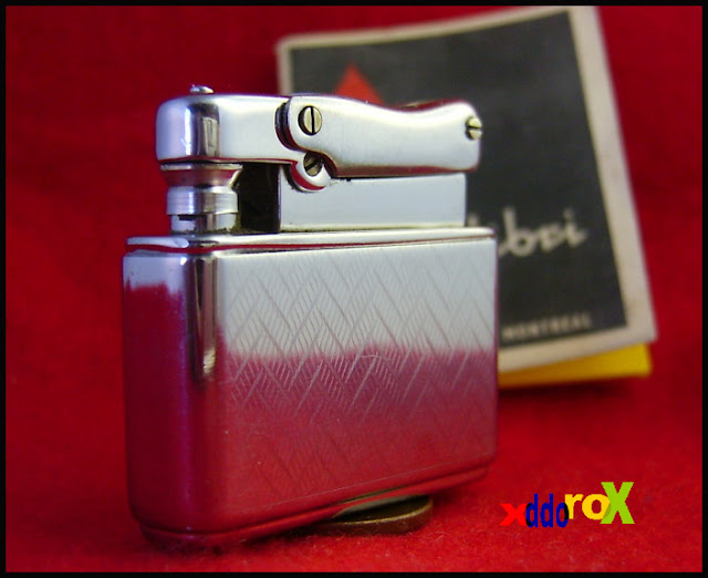
| One of my older efforts |
One thing that I can't understand is how some sellers actually manage to sell their stuff on Ebay with horrible pictures. You want to have a nice picture to make people fall in love with your item. I always had the first picture to be the "beauty shot" and the others were of a more descriptive nature.
It's quite simple to do, it's all a question of lighting, placement, the right setting on your camera and a decent background.
The first step is to find the macro setting on your camera and learn how to use it. Lost your manual? It's online somewhere a Google search away, find it and read it. While you are there look up the brightness setting as well. Sometimes it's hard to get just the right lighting and this feature allows you to fine tune it.
Now that we have the camera all figured out, lets look at lighting. Lighting should come from the side and bounced off the other side by something white. Make sure that your light source is diffused with a piece of paper in front of it. Raw light, from a light bulb let's say, will leave ugly white spots. The best thing is a light diffusing box like I have here. They are simple to make with cardboard, tracing paper and scotch tape.
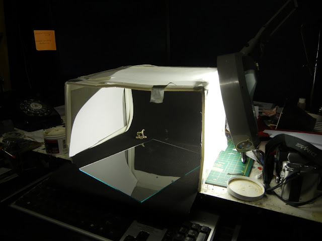 |
| Here you see the light diffused by the tracing paper of the box, a piece of white cardboard on the left to bounce the light back. The subject is on a piece of black velvet paper. It looks like crap but it works. :) |
Next thing is a good background. Find something with no pattern to deter attention from your piece with a contrasting color. Lay it so that it goes from the "floor" and then bends over the back "wall" so as to show no crease at the bottom.
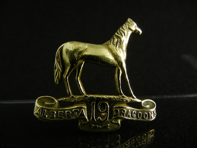 |
| Looks good but it's two dimensional missing depth. |
Lastly it is important on how you show off your piece. We tend to take pictures of an object so to show the more details. What happens then is that the piece is flat and becomes more of a 2D image with no depth. A 3/4 view is a lot better even if you lose a bit of the detail of the piece. Use your placement to show off the most important part, the one that will hook the viewer. Don't be shy and fill the image with as much of your subject as you can. You can always take other shots to show more details but those should be secondary shots, not your main one.
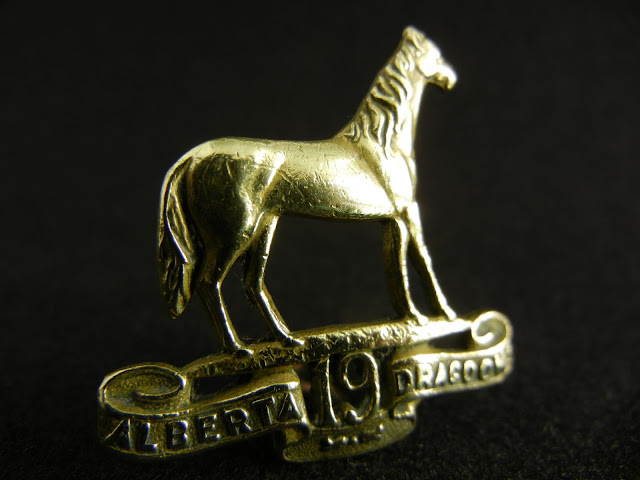 |
| Better |
Hope this helped.
Thanks for watching.
Gerry :)


No comments:
Post a Comment